
When it comes to designing a space, whether it’s a home, office, or website, color plays a crucial role in setting the tone and atmosphere. With so many colors to choose from, it can be overwhelming to decide on a palette that works harmoniously. This is where the 60-30-10 color ratio comes in – a timeless design principle that can help you create a balanced and visually appealing color scheme.
What is the 60-30-10 Color Ratio?
The 60-30-10 color ratio is a simple and effective way to create a harmonious color scheme. The principle is based on dividing a color palette into three parts:
- 60%: A dominant color that sets the tone for the space
- 30%: A secondary color that adds contrast and interest
- 10%: An accent color that adds a pop of color and creates visual interest
Why Does the 60-30-10 Color Ratio Work?
The 60-30-10 color ratio works because it creates a balance between different colors. The dominant color (60%) provides a sense of stability and calmness, while the secondary color (30%) adds contrast and creates visual interest. The accent color (10%) adds a burst of energy and creates a focal point in the space.
How to Apply the 60-30-10 Color Ratio
Applying the 60-30-10 color ratio is easy. Here are some tips to get you started:
- Start by choosing a dominant color that reflects the mood and atmosphere you want to create in your space.
- Select a secondary color that complements the dominant color. This color should be slightly contrasting, but not jarring.
- Choose an accent color that adds a pop of color and creates visual interest. This color should be bold and eye-catching.
- Use the 60-30-10 ratio as a guideline, but feel free to adjust the proportions to suit your personal taste and style.
Examples of the 60-30-10 Color Ratio in Action
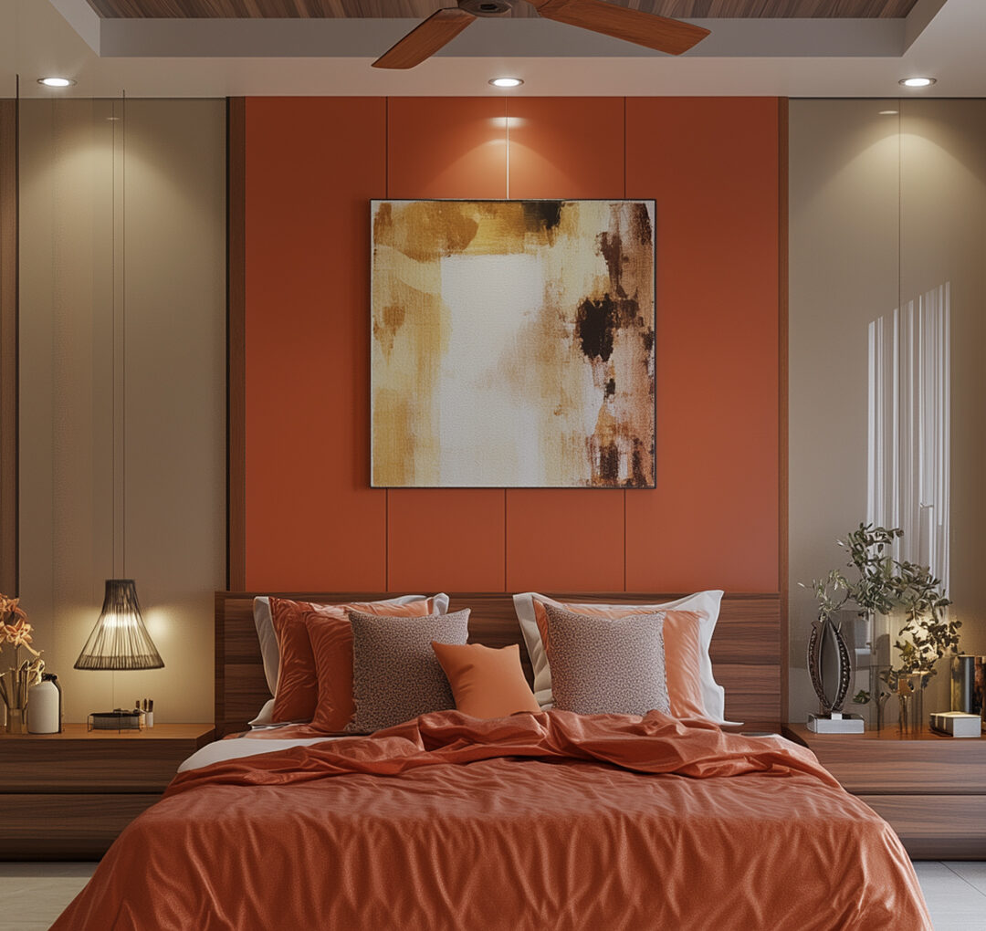
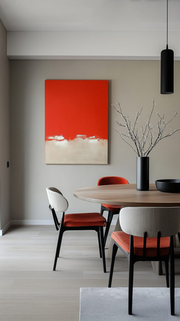
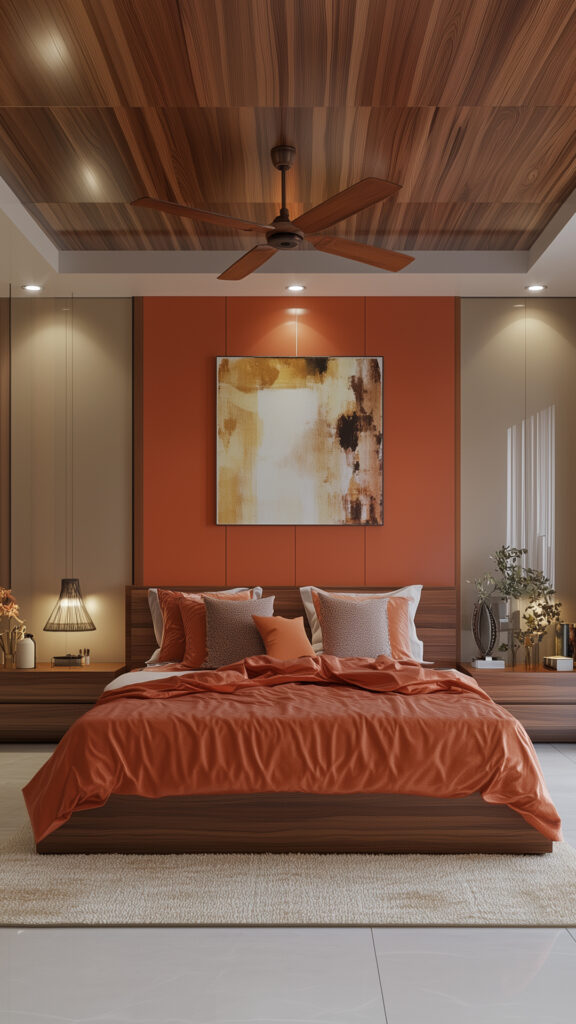
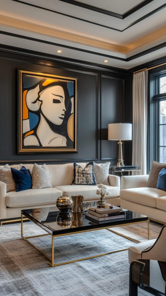
The 60-30-10 color ratio is a versatile principle that can be applied to various design fields, from interior design to graphic design. Here are some examples of the 60-30-10 color ratio in action:
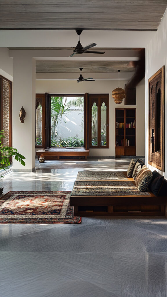
- A living room with a dominant color of beige (60%), a secondary color of blue (30%), and an accent color of yellow (10%).
- A website with a dominant color of navy blue (60%), a secondary color of light gray (30%), and an accent color of orange (10%).
- A bedroom with a dominant color of pale green (60%), a secondary color of creamy white (30%), and an accent color of deep coral (10%).
Conclusion
The 60-30-10 color ratio is a timeless design principle that can help you create a balanced and visually appealing color scheme. By dividing your color palette into three parts, you can create a harmonious and effective color scheme that enhances the mood and atmosphere of your space. Whether you’re designing a home, office, or website, the 60-30-10 color ratio is a principle worth exploring.