As we move toward 2026, color is no longer just about aesthetics—it’s about emotion, intention, and resilience. Global uncertainty, digital fatigue, climate awareness, and a renewed desire for grounding experiences are shaping how we interact with design. In response, leading color authorities such as WGSN & Coloro, Pantone, Sherwin-Williams, Valspar, and Graham & Brown have unveiled palettes that feel deeply human, emotionally intelligent, and quietly powerful.
The color trends of 2026 are not loud or fleeting. Instead, they are balanced, thoughtful, and beautifully sophisticated, offering reassurance while encouraging transformation. From restorative blue-greens to confident smoky pastels and rich, dramatic plums, these shades reflect where the world is—and where it’s heading.
In this blog we explore the key color trends for 2026, the emotional meaning behind each shade, and how designers, brands, and homeowners can use them to create spaces and products that resonate deeply.
Why Color Trends in 2026 Are More Emotional Than Ever
Color forecasting has evolved. In 2026, trends are shaped less by seasonal fashion cycles and more by collective emotional needs. After years of rapid change, people are seeking:
- Stability and reassurance
- Connection to nature
- Quiet confidence rather than excess
- Design that supports wellbeing
Color has become a tool for emotional regulation, storytelling, and identity. This is why the 2026 palette feels grounded yet transformative—offering both comfort and forward momentum.
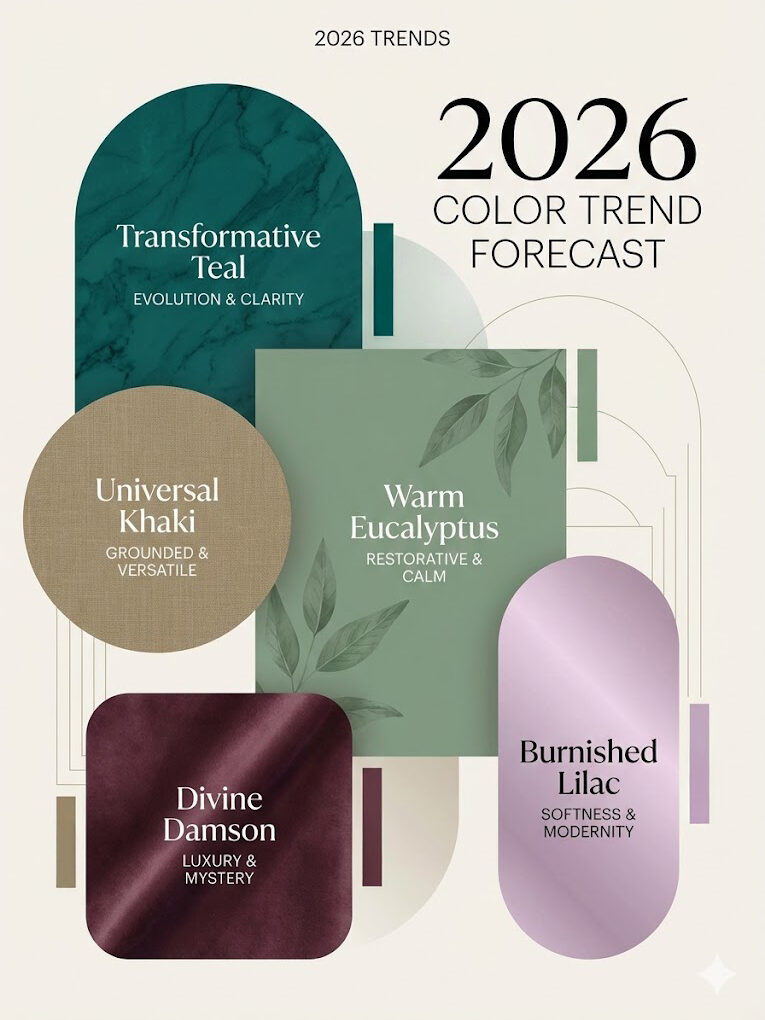
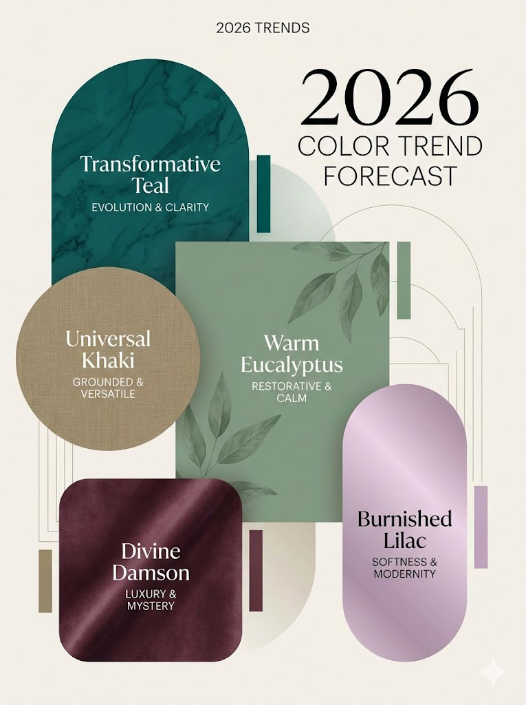
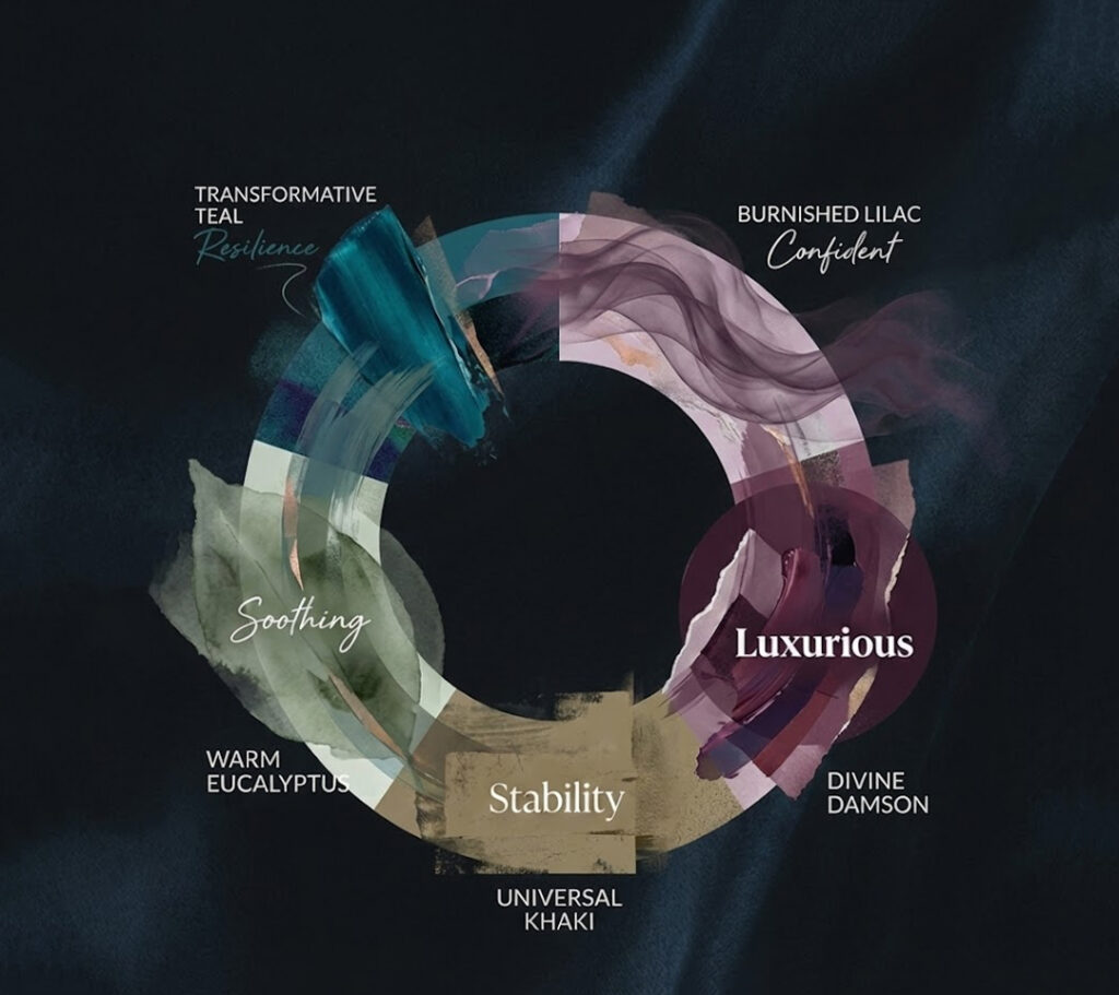
Transformative Teal: The Color of Renewal and Resilience
Leading the conversation for 2026 is Transformative Teal, named by WGSN and Coloro as a defining shade of the year. This blue-green hue sits perfectly between calm and clarity, making it one of the most emotionally intelligent colors of the palette.
Emotional Meaning
Transformative Teal symbolizes:
- Resilience in the face of change
- Healing and renewal
- Balance between logic (blue) and growth (green)
- It reflects a world learning to adapt—emotionally, environmentally, and technologically.
Where It Works Best!
- Interior design: bedrooms, wellness spaces, bathrooms
- Branding: sustainability-focused and future-ready brands
- Fashion & product design: timeless pieces with depth.
Transformative Teal isn’t about escape—it’s about steady evolution.
Universal Khaki: Grounded, Timeless, and Trustworthy
Sherwin-Williams’ Universal Khaki anchors the 2026 palette with a sense of quiet stability. This warm, earthy neutral offers an alternative to stark whites and cool greys, bringing comfort without feeling dated.
Emotional Meaning
Universal Khaki represents:
- Reliability and grounding
- A return to essentials
- Calm confidence
- It reflects the growing desire for longevity over trend-chasing.
Why Designers Love It!
- Acts as a versatile base color
- Pairs beautifully with both warm and cool tones
- Works across interiors, exteriors, and commercial spaces
In 2026, neutrals aren’t boring—they’re intentional.
Warm Eucalyptus: Nature’s Soft Embrace
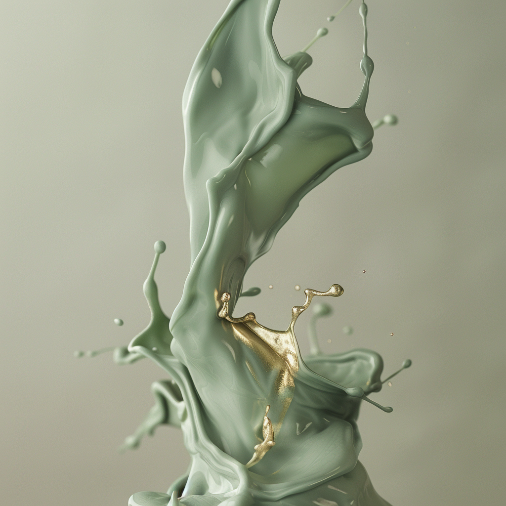
With biophilic design continuing to influence interiors, Valspar’s Warm Eucalyptus taps directly into our need for connection with nature. This soft, green-toned shade feels restorative without being overpowering.
Emotional Meaning
Warm Eucalyptus evokes:
- Calm and balance
- Natural healing
- A slower, more mindful lifestyle
- It reflects the idea that nature isn’t a trend—it’s a necessity.
Ideal Applications!
- Living rooms and kitchens
- Wellness and hospitality spaces
- Eco-conscious branding and packaging
This shade supports emotional wellbeing while remaining modern and adaptable.
Divine Damson: Dramatic, Luxurious, and Expressive
While many 2026 colors lean toward softness, Graham & Brown’s Divine Damson introduces richness and drama. This deep plum tone adds depth, confidence, and a sense of indulgence.
Emotional Meaning
Divine Damson symbolizes:
- Creative expression
- Sophistication and bold individuality
- Emotional depth and storytelling
- It responds to a renewed interest in intentional luxury—less excess, more meaning.
How to Use It!
- Accent walls and statement furniture
- Fashion, beauty, and premium branding
- Spaces designed for intimacy and creativity
Divine Damson proves that drama, when used thoughtfully, can feel empowering rather than overwhelming.
Burnished Lilac: Quiet Confidence in Color
Pantone’s Burnished Lilac redefines pastel for 2026. This smoky, muted purple is subtle yet expressive—perfect for a generation that values authenticity over attention.
Emotional Meaning
- Burnished Lilac conveys:
- Quiet self-assurance
- Emotional maturity
- Soft optimism
- It sits between nostalgia and modernity, making it incredibly versatile.
Best Uses
- Fashion and lifestyle products
- Digital design and branding
- Contemporary interiors seeking softness with sophistication
This is confidence without noise—an essential theme for 2026.
The Bigger Picture: What 2026 Color Trends Tell Us
Together, these shades tell a powerful story. The 2026 color palette is about balance:
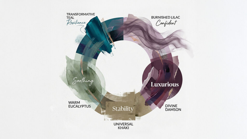
- Between nature and technology
- Between softness and strength
- Between stability and transformation
Rather than chasing novelty, brands and designers are choosing colors that last, emotionally and visually.
Key Themes Across 2026 Color Trends
- Emotional intelligence in design
- Nature-inspired hues with modern depth
- Neutrals as foundations, not fillers
- Color as a reflection of values
How Brands and Designers Can Use 2026 Color Trends
To use these colors effectively, intention is key. In 2026, successful design isn’t about using every trending shade—it’s about choosing the ones that align with your message.
Tips for Application
- Use Transformative Teal or Warm Eucalyptus for wellness-focused experiences
- Anchor spaces with Universal Khaki for longevity
- Add emotional richness with Divine Damson
- Introduce softness and confidence through Burnished Lilac
When used thoughtfully, these colors don’t just decorate—they communicate.
Final Thoughts: A Sophisticated and Thoughtful Future
The color trends of 2026 reflect a world becoming more reflective, emotionally aware, and intentional. These shades don’t shout—they speak with clarity and depth. They invite us to slow down, reconnect, and design with purpose. From the resilience of Transformative Teal to the quiet confidence of Burnished Lilac, 2026 is defined by meaningful color choices that support wellbeing, creativity, and balance.
In a fast-moving world, these colors remind us that true sophistication lies in thoughtfulness.